Raised Detail
Custom Embossed Caps
Embossed, debossed and raised marks all create the same impression — a logo you can feel as well as read — but they are made three different ways and they fail for different reasons. This page is about the relief effect itself: which direction to use, what the die can and cannot hold, and what has to be settled on a physical sample.
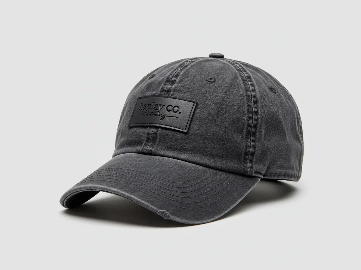
Embossed and debossed are the same die in opposite directions
A debossed mark is pressed into the surface, so the logo sits below the material and reads through the shadow that gathers along its edges. An embossed mark is raised above the surface, so light catches the top of the form and the mark carries further across a room. Same die, same material, opposite direction — and a completely different character.
Debossing is the understated one. It stays quiet at arm's length and only really resolves when someone is holding the product, which suits tonal branding and a restrained retail look. Embossing is more public: a raised edge gives a highlight even in a low-contrast colour combination, so a dark mark on a dark material can still be legible.
The direction should be chosen against the weight of the logo, the material it sits on and the light the product will be seen in. Then it has to be confirmed on a physical sample, because a rendering exaggerates relief and a photograph flattens it — neither one shows the depth or the hand-feel of the finished mark.
The die sets the detail floor
Pressing is not drawing. The effect comes from a die cut to your artwork, and the die is what decides how fine the mark can go: bold strokes, closed shapes and solid forms press cleanly, while hairlines, small type and fine serifs collapse, fill in, or blur into the material around them.
The practical consequence is that artwork is simplified for pressing rather than merely resized. Strokes are opened up, small text is dropped or moved to a route that can carry it — a stitch or a print — and one clear mark reads better than a lockup with several small elements competing inside a small area. It is worth doing this before the die exists, because the die fixes the result from that point on.
That is also why the artwork review and the physical sample belong together. We can flag from the file what the die will and will not hold, but the only way to see how deep and how crisp the press lands on your chosen material is to press it and look at it in your hand.
Colour comes from the material, not from ink
A pressed mark normally carries no printed colour. The effect is tonal: the same material at a different depth, read through light and shadow. On a dark material a debossed mark can be almost invisible at arm's length; on a light one it depends entirely on how the light falls across it.
That is why a thin-line logo fails here twice over. The die cannot hold it, and a tonal effect gives the eye no colour to follow, so form has to do all the work on its own. Logos with enough bold stroke weight survive the press; delicate line work does not. Where colour is essential, it usually has to come from a partner decoration rather than from the press.
Where the effect meets its material, thickness, grain and memory decide how deep the press can go and how well the surface returns to shape after packing and wearing. Two materials that look the same can press differently, so the material and the die are two halves of one decision — and both are settled on the sample.
Press, then embroider or print on top
Pressed detail is often used as a base rather than as the whole mark: a quiet pressed area carrying the brand name, with a small embroidered or printed element adding the colour and the focus. That layering is what gives many premium retail caps their depth.
It also has to be tested as a combination. A press next to a stitch changes how both read, and the heat and pressure of one step can affect the surface the next step works on, so the order of operations belongs in the sample rather than in an assumption.
The most common mistake in this category is a fine-line logo sent straight to press: hairlines fill in, small text merges and the mark arrives looking like a smudge instead of a logo. Send vector artwork, the material you have in mind, the direction you want and where the mark sits, and confirm the result on a physical sample before the bulk run — a photo cannot show depth or hand-feel, a sample can.
Buyer Risk Check
Where this project can go wrong
A hairline logo sent straight to press
Thin lines fill in and small text merges, so the mark arrives as a smudge. Artwork has to be assessed against the die before the die is cut.
Approving the effect from a rendering or a photo
Neither shows the depth of the press or the hand-feel of the surface, which are the two things the buyer is actually choosing between.
A dark mark on dark material with too little stroke weight
A tonal effect has no colour to carry it, so a thin mark disappears at normal viewing distance even though it looks fine in a flat proof.
Pressing a material that will not hold the form
A thin or low-memory material can lose the press, ripple around the mark, or change how the panel sits on the crown.
Stacking a press and a stitch without testing the pair
The two effects compete for the same space, and the heat and pressure of one step can affect the surface the next step works on.
What we confirm before production
Every order is quoted by the actual spec, sampled for approval, and checked against the approved sample before shipping.
Artwork assessed against the die
We flag what will hold and what will fill in before the die is cut, so the artwork is simplified as a decision rather than as a repair.
Direction chosen with the material
Embossed or debossed is recommended against your logo weight and the material, not in the abstract.
Relief confirmed on a sample
Depth, edge crispness and hand-feel are looked at on a physical sample, on the material the bulk run will use.
Layering planned in advance
Where a pressed base is combined with a stitched or printed element, the placement and the order of operations are agreed first.
One specification sheet
Direction, placement, material, carrier and any partner decoration are written down before production starts.
Common questions
Both are made with the same die. Debossed presses the mark into the surface so it sits below the material and reads through shadow, which looks understated and tonal. Embossed raises the mark above the surface so it catches light on the edge and stays visible from further away.
The effect comes from a die rather than from a drawing, and the die has a detail floor. Hairlines and small type fill in or blur, so the artwork is normally simplified: strokes opened up, small text moved to embroidery or print, and one clear mark instead of a crowded lockup.
The press itself is tonal — the same material, read at a different depth through light and shadow. Where a colour is needed, it usually comes from a partner decoration such as an embroidered or printed element placed alongside the pressed detail.
Pressing depends on a die cut to the artwork, and once that die exists it repeats the same effect on later runs. Artwork is reviewed before the die is made, because the die fixes the detail floor for the whole program.
Yes, and the combination is common on premium retail caps: a quiet pressed base carrying the brand name with a small stitched or printed element adding colour and focus. The pair is tested together on the sample, because a press next to a stitch changes how both read.
It depends on the material more than on the press. Thickness, grain and memory decide how deep the mark can go and how well the surface returns to shape after packing and wearing, which is why the material and the die are confirmed together on a sample.
Yes. A free artwork proof shows the layout and the direction, and a physical sample shows the depth, the edge crispness and the hand-feel. A photograph cannot carry those two properties, so the sample is what the bulk run is checked against.
Ready to quote this project?
Send your cap style, logo, quantity and destination. We will reply with MOQ, unit price, sample details and shipping options.
One common carrier of a pressed mark, as a product category.
PVC Patch HatsThe moulded route to a raised mark, as a product category.
Custom Hat Sample ProcessHow the physical sample step works end to end.
Cap Embroidery Stitch GuideWhere fine detail goes when a die cannot hold it.
Custom Baseball HatsEmbossed detail on a standard cap.